
 In September of 2001, “News To Make You Furious” took an unbiased look at the global warming debate in an article titled “They’re not wrong, they’re lying.” (If that doesn’t sound unbiased, think again. It’s entirely possible to come to an unbiased conclusion that you’re being lied to. Richard Nixon
 springs to mind.) But these industry-spawned lies have been a constant “rain” on our necks for years… is there anything new to make you Furious? Yes. The pestilent prevarication in the recent Wall Street Journal op-ed “In Defense of Carbon Dioxide” was so brazen that it wasn’t just an insult to our intelligence, but an insult to our stupidity. In this month’s Furious we’ll take apart a couple of their toppers and point you to solid information that destroys the rest. So what will make you Furious? The fact that many people and policymakers won’t put forth even this minimal level of thinking on an issue so critical to our planet…
We’ll be pointing out a couple individual errors in the article, but you may want to read the whole thing first to make sure we aren’t pulling anything out of context. The op-ed by  Harrison Schmitt and William Happer is titled “In Defense of Carbon Dioxide”. It was published in the May 8 issue of the Wall Street Journal with the subtitle “The demonized chemical compound is a boon to plant life and has little correlation with global temperature”. Before we pass you on to qualified sources we’ll take our crack at the article, restricting ourselves to just the second paragraph. Here’s that full paragraph in all its fraudulent glory…
“The cessation of observed global warming for the past decade or so has shown how exaggerated NASA’s and most other computer predictions of human-caused warming have been-and how little correlation warming has with concentrations of atmospheric carbon dioxide. As many scientists have pointed out, variations in global temperature correlate much better with solar activity and with complicated cycles of the oceans and atmosphere. There isn’t the slightest evidence that more carbon dioxide has caused more extreme weather.”
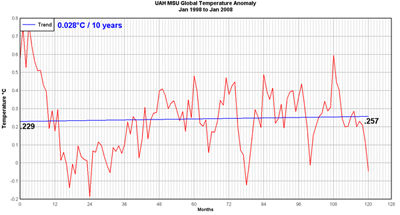 Let’s deal with “The cessation of observed global warming for the past decade or so” first. They toss this out as though it was well-known and true, and this graph of the past 10 years’ temperature (not included in the article) would seem to support their position. (Even through the graph does show a .028° rise, we’ll let them slide on that.)
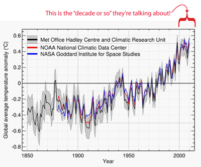
Yea! Global warming is solved, and we can all rest easy! But only until we look at a slightly bigger picture. This next graph shows a little longer time range, and includes the part that has actual climate scientists worried. As you can see, the “decade or so” when global warming “ceased” is only a small, non-representative part of a clear trend upward. There are other drops in temperature since the trend started around 1910, most notably around 1940, but these interim drops do not IN ANY WAY indicate a downward trend in temperature.
Lest you think this second graph just “cherry-picks” data to reinforce global warming, let’s look at a couple others from longer timescales.
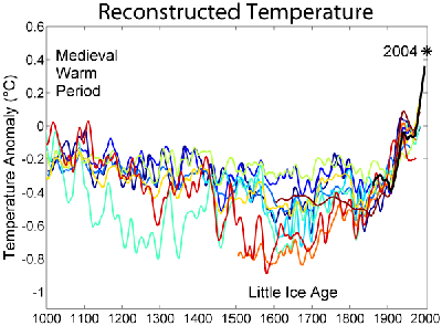
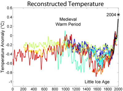
These are “reconstructed” temperatures going back 1000 and 2000 years respectively, rather than the “observed” temperatures of the first two graphs. This means the data are less complete and the trends differ slightly depending on how the temperatures are reconstructed (represented by the different line colors). But you can plainly see in both graphs that, no matter how you cut it, the jump in temperature is a recent and unprecedented phenomenon. And going back even further the pattern still doesn’t change, as this graph going back 800,000 years shows. (That’s our little slice of history on the far right of the graph.)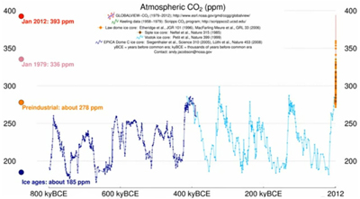
So why is this a lie, and not just innocently wrong? Because these filthy quislings KNOW BETTER! Any scientist, even the shills who work for oil-company-funded think tanks like those created by Exxon-Mobil, understands basic statistics. They know that picking a small interval of data may or may not be representative of the larger trend, but they all know enough to check what the larger trend actually is. THEY AREN’T F—ING IDIOTS! They can SEE that the trend doesn’t support their feeble conclusion, but they SAY IT DOES ANYWAY! If you know something’s wrong and present it as true anyway, that’s a lie.
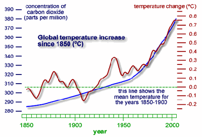 But the fine folks at WSJ didn’t stop there; they squeezed two lies into just that one sentence. The second half, mentioning “…how little correlation warming has with concentrations of atmospheric carbon dioxide”, deserves a closer look itself. How much correlation IS there between CO2 and warming? Amazingly, we have a graph; temperatures are in red and CO2 is in blue…
Looks like a pretty strong correlation, and it’s just one of thousands of graphs from thousands of studies showing exactly the same thing. The authors of the WSJ piece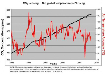 obviously know about this research, so the idea that there’s “no correlation” between CO2 and temperature is a lie on the face of it. It would be easy enough to say “case closed”, but here’s what’s fascinating about this particular graph… it comes from an article in the Houston Chronicle that begins with the graph at right showing there ISN’T a correlation! After showing both graphs the author, John Nielsen-Gammon, continues with this caution:
“Both presentations are tricking you. Carbon dioxide is not the only factor affecting global climate, nor is carbon dioxide so inert as to have no effect whatsoever. Indeed, it is almost impossible to find a graph such as this that is not trying to trick you in some way.“
So is it impossible to fairly show a CO2/temperature correlation? Not at all. In fact, Neilsen-Gammon goes on through a painfully long process of developing an accurate, unbiased graph of temperature and CO2 trends that’s not misleading. That final graph,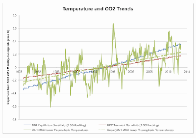 from 1978 to today, is at right. The wild green line is temperature, with the temperature trend as a straight green line. It tracks closely with the two aspects of CO2 content in red and blue, clearly, accurately, and fairly indicating a correlation of CO2 and temperature. Now, we can comfortably say “case closed”, at least on this point.
We could go on and on with the lies, distortions, red herrings, and straw men that pollute this WSJ propaganda piece (and God knows we want to!) but we’ll hand it over to more qualified debunkers at this point.
Phil Plait at Slate attacked the WSJ article with “No Need to Worry About Global Warming, Folks: More Carbon Dioxide Will Be Awesome” on May 10, 2013
Media Matters took their shot at it with “Wall Street Journal’s Idiocracy: CO2 Is What Plants Crave” on May 9, 2013
To explain the larger picture of how industry-funded shills put this crap out in the first place, we’ll refer you to two sources.
Bill Moyers has an excellent piece on how industry PR tactics have played out in the lead poisoning issue
DeSmogBlog is an exhaustive resource specifically on the global warming info war. It includes point by point refutations of individual issues, biographies and backers of the “scientists” denying global warming, and excellent real-science reports on the issue.
For unbiased information on global warming science for people of all educational levels, we’re very proud of our 2011 article “Science and History of Climate Change- Learn the science without the hype… from either side”, which is chock-full of links to real information. Two of the best are to The Discovery of Global Warming (a complete, cross-referenced, and hyperlinked guide to the history of climate change science) and RealClimate.org (a commentary site on climate science by actual working climate scientists).
And finally, let us leave you with two links to jaw-dropping graphics that make all this science palatable…
Time history of atmospheric carbon dioxide is a motion graph of atmospheric CO2 where we pulled the “800,000 year graph” in the article above.
This link will take you to a NASA time-lapse plot of global temperatures plotted on a map from 1937 to today.