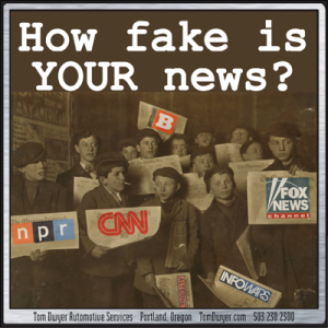
FAKE NEWS! You’re being hoodwinked by the entrenched Liberal Media! Look out! The Right Wing Echo Chamber is blasting out lies!
Everyone sees bias in news from “the other side”, but are we right? And how easy is it to see the faults in our own sources?
People making top-level decisions have access to first-hand, real-time data and expert analysis (if they choose to use it), but out here in the cheap seats we have, at best, second-hand information and rumor to form our worldview. How credible are our go-to news sources? What about the ones from across the aisle? Are there any unbiased sources at all? What even makes a credible news source to begin with? Take a look at this media analysis and see if you agree with their conclusions. You might not agree with every ranking, (we certainly had quibbles of our own), but it’s a wonderful tool to help filter informational wheat from propaganda chaff…
It’s been said “disappointment arises from expectation”, and if you’re expecting a definitive ruling on which news sources are biased you’ll be disappointed. In fact, there is no such final expert arbiter to turn to, which is why a site called “All Generalizations Are False” tried to make a good stab at it. Author Vanessa Otero sorted dozens of news and opinion outlets according to fact/opinion balance as well as left/right bias. She has no real credentials to say her evaluation is “correct” and it’s an issue she engages with head-on…
“I’m a practicing patent attorney in the Denver, Colorado area, and I have a B.A. in English from UCLA and a J.D. from the University of Denver. I’m not a journalist by training, and I don’t claim to be one. So why should you listen to me about the quality of news sources? You shouldn’t. In fact, you shouldn’t listen to anyone who tells you that you should think or believe a certain thing a certain way. But you’ve come to my site to find out what I have to say about the news anyway, so I’ll lay out a few reasons why you could choose to value my assessments. Consider them and then determine for yourself whether this information is valuable to you.”
So readers are left to look at the material she produced and decide what value there may be. While there may be nothing groundbreaking in it, we found her approach a huge improvement over gut feelings or facile accusations.
Methodology
So what makes this chart more than just a pretty presentation of Otero’s gut feelings? She herself notes, in fact emphasizes many times throughout the site, the inevitable subjectivity in judging any news source. It may be impossible to be perfect, but it’s not impossible to develop a rigorous and even-handed methodology applicable to any source. Otero makes her methodology transparent and thorough, and does a good job integrating feedback from the thousands who have nitpicked her process and result. There are too many details to go into here, so here’s links to her methodology in detail…
The Chart, Version 1.0: Original Reasoning and Methodology
The Chart, Version 2.0: What Makes A News Source “Good?”
The Chart, Version 3.0: What, Exactly, Are We Reading?
The Chart, 3.1 Minor Updates Based on Constructive Feedback
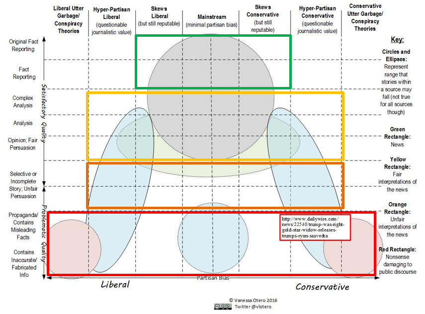 Otero’s process produced this underlying chart of media types and credibility, independent of the sources to be plotted on it. She picked a ideological neutral point, with left/right bias ranging from fact to fantasy to each side. The vertical axes range from “just the facts” at the top to “just the anti-facts” at the bottom. The circles and ellipses indicate a range that stories within a source might fall, but it doesn’t hold true for all sources.
The Chart
This is “The Chart” v3.1, updated Feb 2018.
 In our opinion it was fairly accurate and valuable, though of course we had quibbles…
- Where is FOX News? Looked and looked but can’t find it. FOX Daily Wire is there, but even we wouldn’t paint the main network with the brush of Daily Wire. Seems a big oversight, but again, maybe we’re just missing it.
- We hadn’t heard of the “junk” lefty sites Palmer Report and Patribotics. Perhaps it’s our own lack of media awareness, and perhaps it’s that junk stories just don’t get as much traction in LibWorld as they do in RightyLand so these sites don’t have the high profile of NewsMax or Breitbart (or InfoWars, but we’ll get to them in a moment). But maybe that’s a value of this chart… if we see something from these sites in the future, we’ll know to take it with a grain of salt.
- The neutral media line is to the right of NPR, BBC, WaPo, NYTimes, and others that we would put as more neutral (certainly as a group). Maybe that’s accurate, maybe it’s a result of the fact that “reality has a liberal bias”, and maybe it’s our own bias showing. But again, that’s the value of the chart… to get us to question our unquestioned assumptions.
So that’s our take on “The Chart”. What’s yours? BTW, as we mentioned Otero is a patent attorney and did this chart as a non-paying exercise. If you think The Chart has value and would like to support her ongoing work then you might consider buying a poster or high-quality image, or even just donating something to help in this high-quality media analysis.
Other Analyses
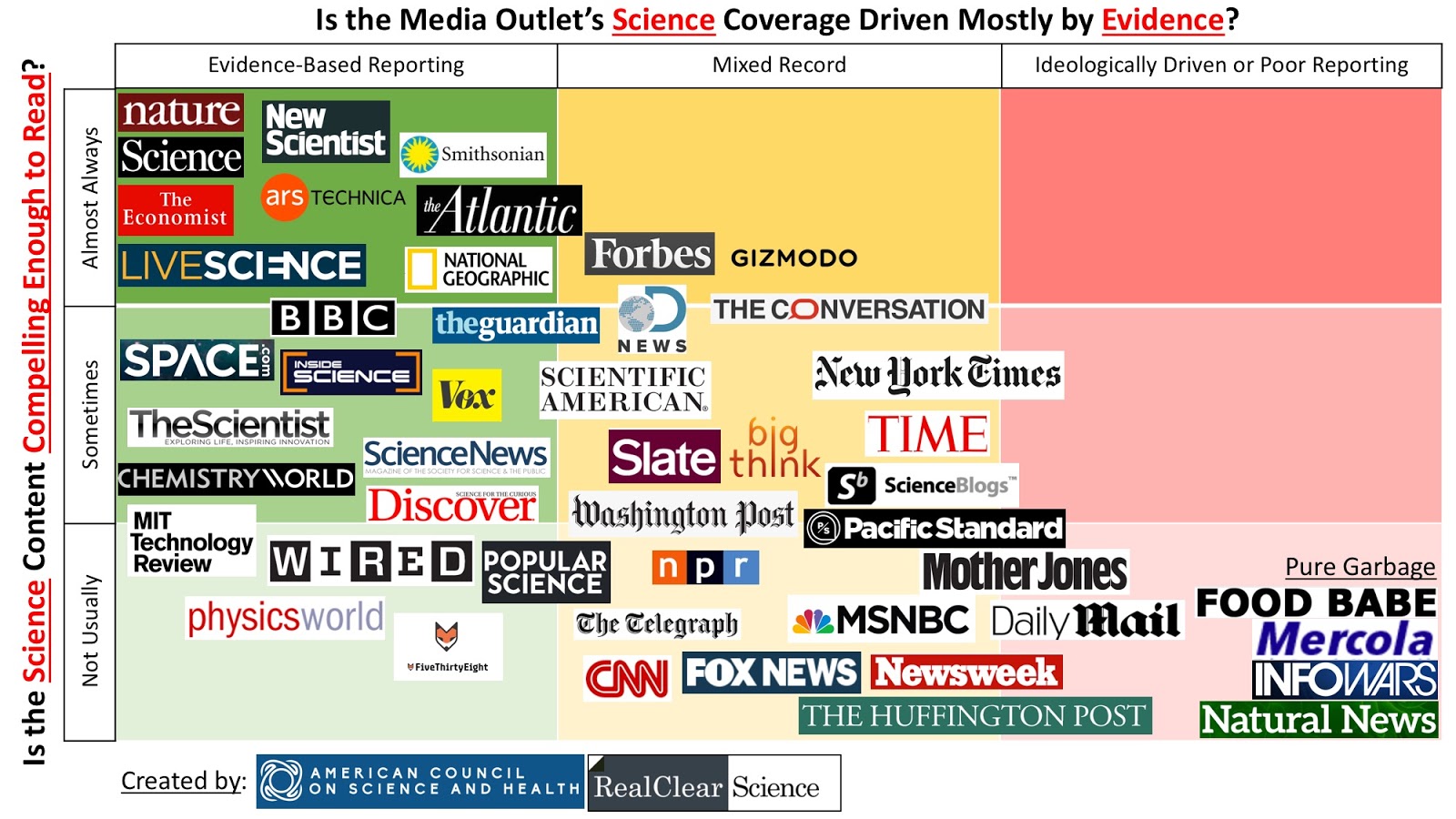
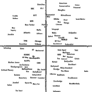
Perhaps the easiest way to show how good this chart is is to compare it with others, so we have a gallery to share with you. Most seem to be good-faith efforts to define news source bias with varying degrees of detail or usefulness and on various axes.
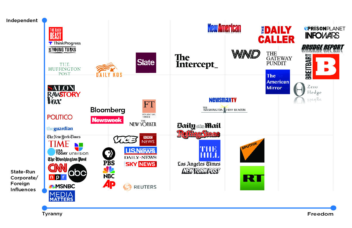
The big stand-out, though, is the chart prepared by Alex Jones over at InfoWars. In every chart we looked at, no matter their source, no matter their other disagreements, InfoWars was ranked as the farthest-right, least-content source in existence. That obviously didn’t sit well with the inimitable Mr. Jones, who created his own bias chart plotting “Freedom or Tyranny” vs “Independent or State-run”. He came out as the freest, most independent news source in this evaluation, so we can all sleep better. Guess it goes to show that any of these charts are only as good as the intent behind them.
None of us has a complete view of the world; we have no choice but to see it from our own point-of-view based on the information available to us. The accuracy of our worldviews depends on the accuracy of that information. Understanding the bias and reputation of our news sources doesn’t guarantee we won’t be duped but it can help protect us. A varied information diet, from a variety of reputable sources across the spectrum, gives us an solid intellectual base to build on in any direction.
Digging Deeper
Keepin’ It Real: Tips & Strategies for Evaluating Fake News, Loyola Marymount University, 2017
AllSides.com provides news stories in columns with takes from the “Center”, “Left”, and “Right” for comparison. Their Media Bias Ratings list has hundreds of news outlets and their ideological rankings
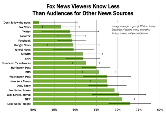
Survey: NPR’s listeners best-informed, Fox viewers worst-informed, by Andrew Beaujon on Poynter, May 2012
Fake News Sharing In US Is A Rightwing Thing, Says Study, Alex Hern in The Guardian, Feb 2018
The Computational Propaganda Project, Oxford University
A Rigorous Scientific Look Into The ‘Fox News Effect’, by William Poundstone on Quora (quoted in Forbes) Jul 2016
The Wall Street Journal’s “Blue Feed, Red Feed- See Liberal Facebook and Conservative Facebook, Side by Side” presents streams of Liberal/Conservative posts on a variety of topics.
Elevate Your News Evaluation- Spectrum of News Sources by UCMerced Library
The Alignment of Political Media, by Robert Mariani on Mitrailleuse.net,
Why do people think PBS has a liberal bias? By Chris Joosse on Quora
MediaBiasFactCheck.com rates and lists hundreds of news and opinion sources
What Do Conservatives Think Of The Media Bias Chart That Started Circulating In 2016? Jon Davis on Quora
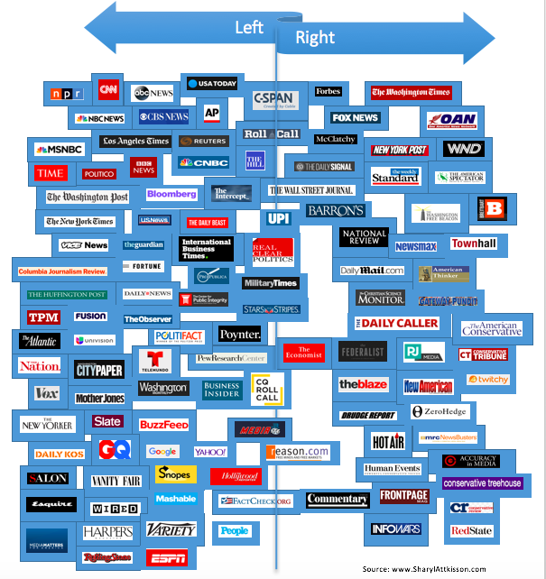
Media Bias: A New Chart, by Sharyl Attkisson on SharylAttkisson.com, Apr 2017
How Biased Is Your News Source? You Probably Won’t Agree With This Chart by Shawn Langlois on Marketwatch, Apr 2018
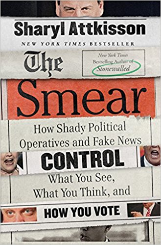
The Smear: How Shady Political Operatives and Fake News Control What You See, What You Think, and How You Vote by Sharyl Attkisson, June 2017
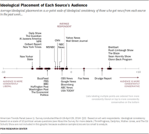
Political Polarization & Media Habits- From Fox News To Facebook, How Liberals And Conservatives Keep Up With Politics, By Mitchell And Weisel, Pew Research Center, Oct 2014
Alternate Reality: Viral Propaganda Chart Demonizes Independent Media: Chart Exemplifies Dying Dinosaur Media’s Extreme Liberal Bias, InfoWars.com, Dec 2016