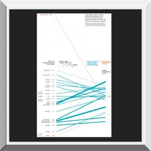
 The Supreme Court made some news towards the end of June having to do with Health Care. While the battle develops surrounding the decision, we thought it might be nice to remember why we’re fighting it. This graph from National Geographic shows the relationship between health spending and outcomes for 21 different countries, plotting spending, life expectancy, and number of doctor visits. Quick question before you look- can you guess which country is the outlier from all the others?
Popcorn- Best healthcare graph ever
This entry was posted in 2012 July, Newsletter Columns, Newsletters, Popcorn Shorts, Uncategorized. Bookmark the permalink.


