
This month’s News To Make You Furious is mostly about one number, the Case-Shiller Index of Home Prices. This gold standard of home prices pulls prices from across the country in major real estate markets to form a conglomerate price for the entire country. Best of all, the numbers are adjusted for inflation across time, so the graph accurately compares 1890’s apples to 2000’s oranges. (Click on any of the graphs below for a much more detailed picture.)
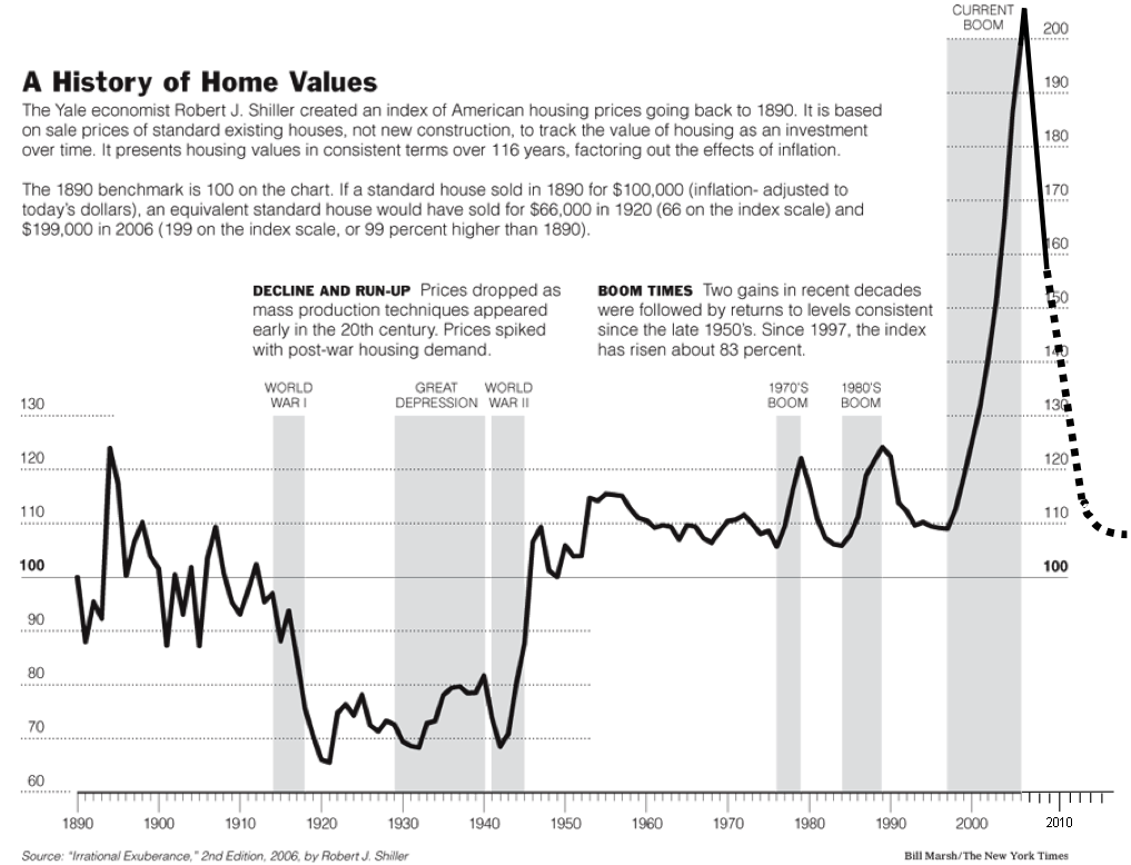
 Where we started
Here’s a graph of the Index published in the NY Times, starting in 1890 and continuing to 2006, just prior to the housing bust. The first group of gray bars show the spans of World War I, World War II, and the Great Depression. The second group shows the booms of the 1970’s and 1980’s.
 Future projections
After the bust occurred, the folks at The Big Picture (“…a compendium of what a Wall Street money manager is looking at, thinking about, and writing on.”) added the projected crash and recovery trend based on historical trends. (Also note the green trend line of house prices, it’ll be important in just a minute)
 How accurate are the projections?
As real data rolled in, projections could be checked. The Big Picture folks posted revised charts for 2008, 2009, 2010, and they’re out with the update for 2011, at right. (The little bump above the red dotted line, showing about a 5% gain on the price lost in the bust, is the result of the 2009 tax credit policy). Big Picture will be posting additions “…annually until mean reversion to fair value is achieved.”
OK, that’s bad, but I’m not really FURIOUS yet…
Don’t worry, “News To Make You Furious” is more than a title, it’s a promise… The graph shows that the average home lost about $90,000 in the bust. Look again at the green trend line. This shows that the average home gained about $5000 in real price in the 60 years between 1960 and 2020, for a rate of increase of about $83.33 per year.
So, all things being equal, if you’re going to sit on your home until it gets back up to the price it had in 2006, how long will you have to wait? Approximately 1,080 years.
 We’ll leave you with one more graph. All the Case-Shiller information above deals with house prices, not values. What’s the difference? The graph at right tells the story.
Furious yet?


